Stock market traders utilize a wide arsenal of tools to enhance their performance. One of the most essential tools are candlestick stock charts. These enable traders to visually interpret price action to make more informed decisions on trades especially when used in conjunction of other complementary tools and strategies.
What is a Stock Chart?
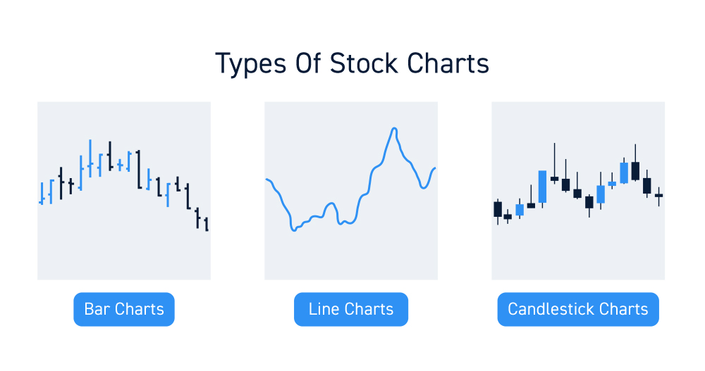
A stock chart is a graphical display of executed trades and various other data to provide a visual representation of the price action on the underlying stock. Charts are used to identify and analyze price support and resistance levels, trends, and historical patterns. There are various types of charts that can be used to interpret the action. Some of the most popular types of charts are bar charts, line charts and candlestick charts. Different traders have their own preferences between which charts to use since they utilize the same data but typically display them differently.
What are Candlestick Charts?
Originally created by Japanese rice traders in 18th century Japan, candlestick charts were used to interpret price trends. They were introduced to the Western world by American Steven Nison through a series of books starting in 1991 with, “Japanese Candlestick Charting Techniques”. While originally plotted by hand, computer technology enabled them to be created quicker and more efficiently.
The main appeal of candlestick charts is that they contain far more information than a simple line chart.
Why Most Traders User Candlestick Charts
Throughout the years, the practical nature and efficiency of candlesticks lent to their explosion in popularity. The adoption of candlestick charts by most trading platforms have made them the standard type of stock chart used by traders. Candlestick charts can be used across all financial instruments along with numerous indicators and patterns to develop trading strategies. They are easy to understand, convenient to use and enable efficient price interpretation.
Components of a Candlestick
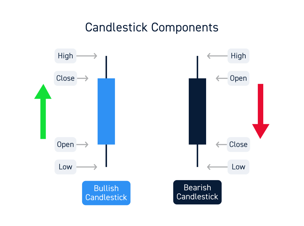
The “timeframe” of a candlestick chart identifies the period of time that each candlestick represents. A 15-minute candlestick chart is composed of candlesticks representing 15-minute increments of data. A candlestick is composed of four components, which are key prices for that specified timeframe). These four components of a candlestick are the prices making the open, high, low and close:
- The open is the first trade price for the candlestick period. This also marks one end of the body of the candle.
- The high is the highest trade price for the candlestick period and is also displayed as a wick, which is a vertical line.
- The low is the lowest trade price for the candlestick period and also displayed as a wick or tail.
- The close is the last trade price for the candlestick period and marks the other end of the body.
A candlestick body is comprised of the open and close trades. If the open is higher than the close, then the body is colored red. If the open is lower than the close, then the body is colored green. The high and low is represented by the vertical lines above and below the body, also referred to as wicks or tails.
The Story Behind Each Candle
Each candlestick represents a story in relation to price action. Consider each candlestick like a corner store in the neighborhood that sells fresh bread dynamically priced based on the day’s supply and demand.
Every open the first customer buys the first loaf and then the rest of the customers come do their shopping. Based on supply and demand, someone will pay a high price and someone will pay a low price. At the close of store hours, the last customer to buy a loaf of bread represents the close. If the last loaf sold for less than the first loaf, it indicates that demand has fallen. On the flipside, if the last loaf was sold at a higher price than the first loaf, it indicates demand is good. If customers came in and continues to buy bread at higher prices and the last load sold at the highest price of the day, it would be represented by a candlestick with no upper wick indicating demand was very strong.
A Broader View
By stringing more candlesticks together, it paints a broader view of the supply and demand for the bread. A week’s worth of store data provides a more thorough gauge of the business. As time goes by, patterns will materialize and repeat themselves. Strategies to anticipate and manage these patterns can be developed to optimize business. This is how candlesticks are used, but instead of bread, it measures the price action of the underlying stock.
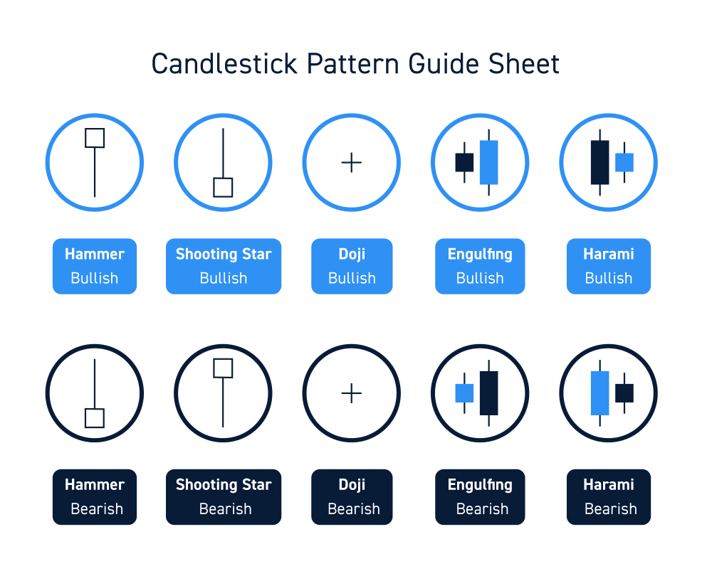
Common Candlestick Patterns
Thanks to history having a habit of repeating itself, a number of time tested common candlestick patterns have been identified.
Types of Candlestick Patterns
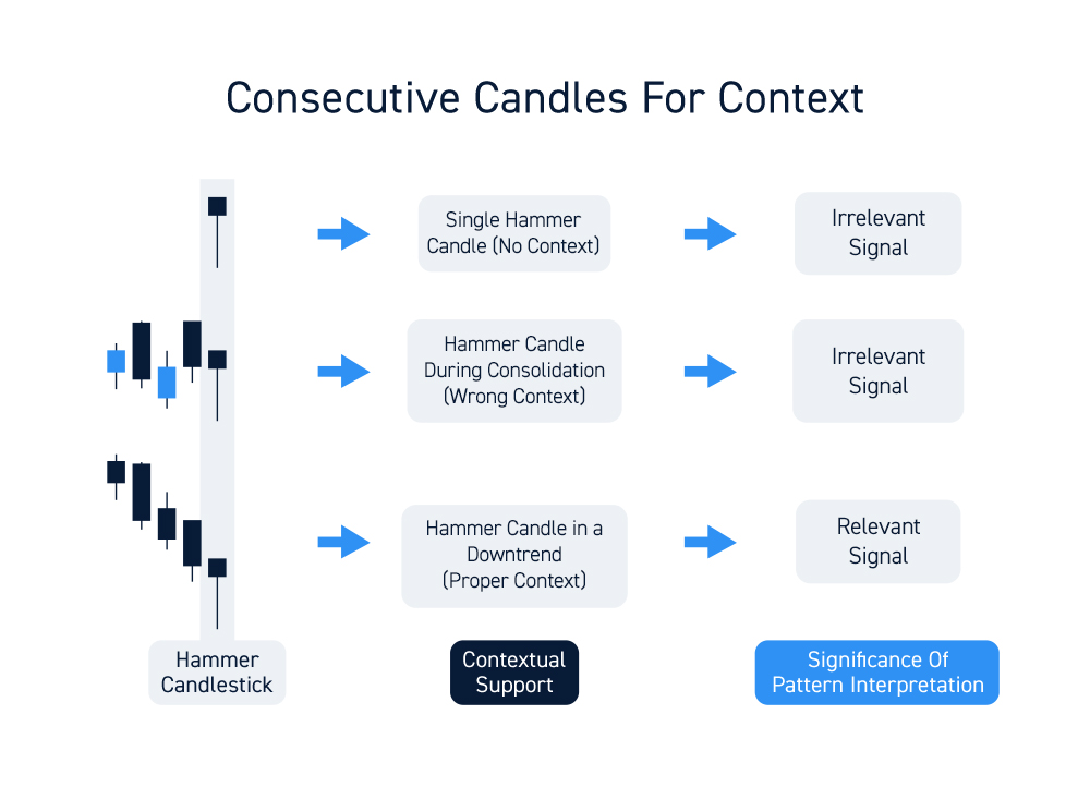
A single candle is hard to interpret without context. Context refers to the preceding candles and, in many cases, the following candles. Make sure to always interpret the candle in context. For example, a single hammer candlestick alone can appear identical on two different charts. If the hammer candle forms after four preceding large red candles, then it carries more significance compared to a hammer candle that forms during a “consolidation” of alternating red and green candles. Therefore. common candlestick patterns tend to be composed of two to three consecutive candles. Even single candlesticks need a second candle to confirm the pattern.
Here’s a guide to some of the more common candlestick patterns to help you interpret price action as you develop trading strategies. Keep in mind that being told what a candlestick formation typical does and experiencing it firsthand are two different things. Take the information as a guide but always trust your firsthand experience to get an intuitive feel for the patterns.
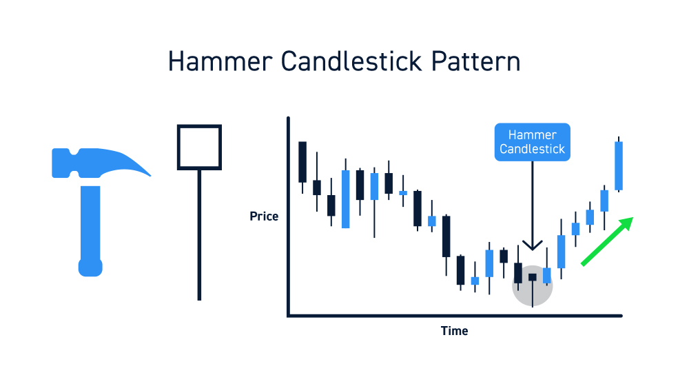
Hammer candles indicate a potential ‘bottom’ price reversal. Hammers are composed of a smaller body and a tail that is at least two or more times the size of the body. They should be preceded by at least three consecutive lower low (tails) candles. Hammers reflect a capitulation selling climax as the last hold-outs decided to exit their shares in a panic. This may trigger buyers to come back into the stock lifting the price back up very close to or above the opening price.
Shooting Star candles are the opposite of a hammer, often referred to as an inverted hammer, indicating a potential price ‘top’. These form when buyers lose patience and chase an entry at any price they can get. This is illustrated by the long wick above a small body, which should be at least double the size of the body. Shooting star candles should be preceded by at least three consecutive higher high candles. While these are single candlesticks, they are only truly confirmed by the preceding candles and the following candlestick.

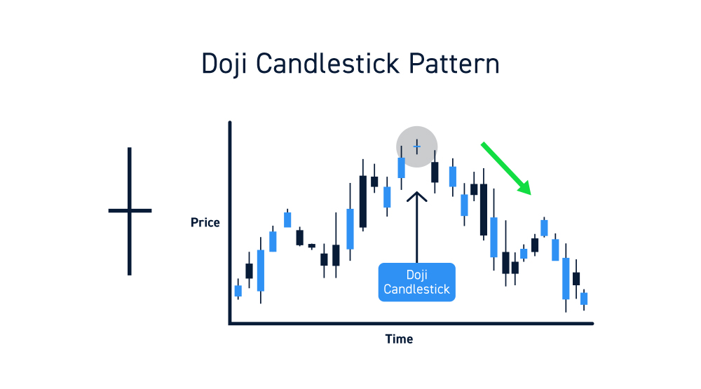
Doji candles are indicate indecision, either a price reversal or next leg is coming. They are composed of a flat body with long tails and wicks. The opening price is the same as the closing price. This sets the ‘line in the sand’ which the following candle will either close above or below to determine the direction of the price move. Doji candles can be bullish or bearish.
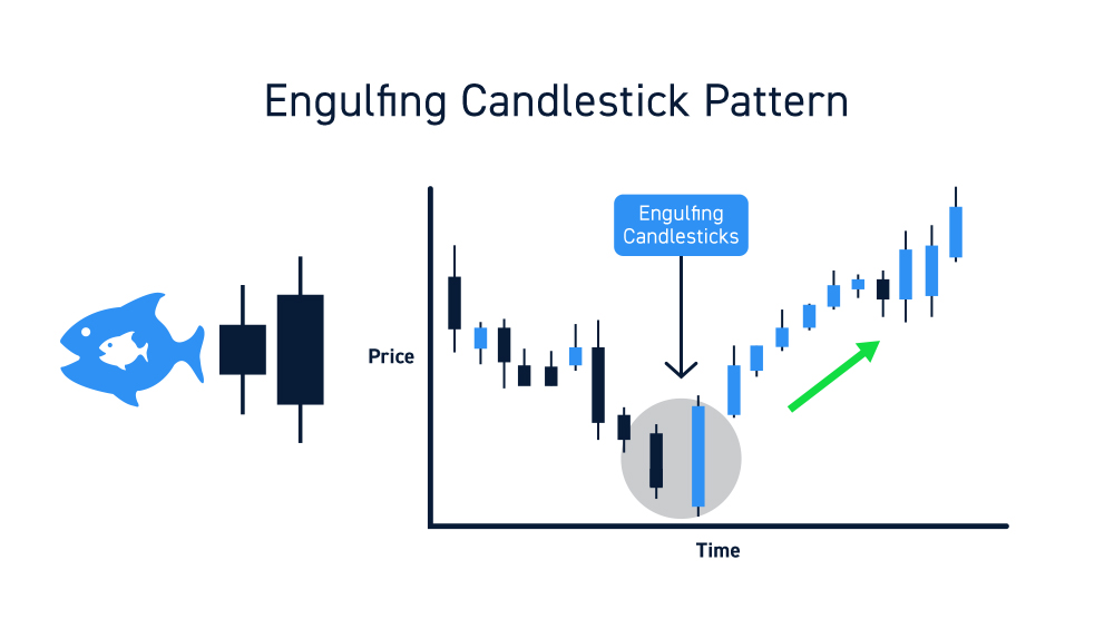
Engulfing candles are two-candlestick patterns that indicate a powerful price reversal. The preceding candlestick gets completely engulfed by the following candle. The body of the candle completely covers the whole range of the prior candle in the opposite direction with no tails or wicks. A bullish engulfing pattern forms at the bottom of a downtrend when the candle body completely engulfs the prior red candle including the highs and lows. A bearish engulf candle is the opposite as it forms at the top of the trend with a red candle body that completely swallows the high and low range of the prior green candle.
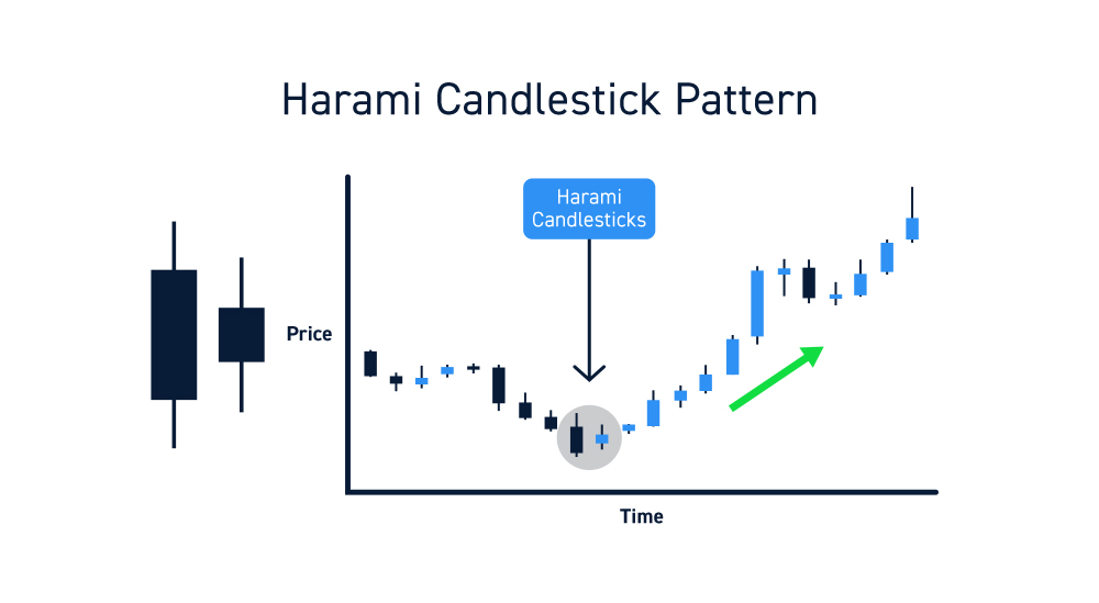
Harami candles are similar to engulfing candles but a smaller body forms after a large body candlestick to indicate a price reversal. This is also referring to as a “pregnant” woman two-candle pattern (harami is Japanese term for pregnant) as the smaller body candle forms within the range of the prior large candle. A bearish harami candle pattern forms at the bottom of a downtrend indicated by a smaller body candlestick that is contained within the prior low candle stock. The tail and wick should completely be contained within the range of the prior low candlestick. The bullish harami is the opposite version that forms at the top of a trend producing a smaller lower high candlestick contained with the body of the prior high candlestick.
Consider making Candlestick patterns an essential component of your trading system. As with all trading tools, attain firsthand knowledge and experience by tracking and following them on a regular basis so you can spot them quickly. Candlesticks are building blocks for technical analysis and strategy development. Familiarity is the crucial first step.